I’ve been on a quest the last few weeks to find my ultimate ultramarine blue and I wanted to share the results with you — but first, the backstory!
The Backstory
I’ve been using ultramarine blue from Daniel Smith, Winsor & Newton and DaVinci interchangeably for years now and wasn’t truly satisfied with any of them. I mostly paint in a hot, dry climate but sometimes take my paints on adventures to more humid areas and I’ve been encountering some issues, namely:
- Daniel Smith (DS) dries rock hard in the pan and takes some effort to rewet the paint to get it usable again; I cringe using it with my good brushes
- Winsor & Newton (WN) is my trusty reliable as far as rewetting goes, but it was weaker in mixes than DS and it’s more expensive here where I live
- DaVinci (DV) rewets easier but it has an odd, almost plastic-y feel that I don’t really like
I went on a mission to try and find an alternative and picked up M. Graham (MG), Schmincke (S), and Holbein (H) paints to try. All of these contain the same single pigment, PB29.
A friend also told me to try adding a few drops of glycerine to Daniel Smith’s paint to help with rewetting so I wanted to try that as well — these swatches are labeled DS w/G. You can find glycrine at some grocery stores or here on Amazon.
How I Tested the Paints
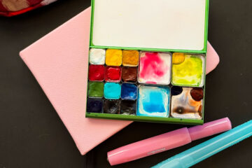
I wanted to test the paints both in the studio and out in the field in the heat, so I took them on several hikes and did some quick swatching and tiny paintings.
Here are my results!
In the Studio
I started by testing the paints in the studio, just doing some quick swatches and mixing them with my most common mixes of DS quinacridone gold, transparent red oxide and quinacridone rose. Note: it was 81 degrees F in the office lol — in April!
Click on an image to see it larger:

The swatch to the right was done by putting down a thick patch of ultramarine blue and then wetting the side of it to try and force a bloom/see what would happen.

After doing some swatches I decided to do some quick little paintings to try and get a better feel for how the paints handle — tree time!

You can really learn a lot by doing some tiny paintings — more below!
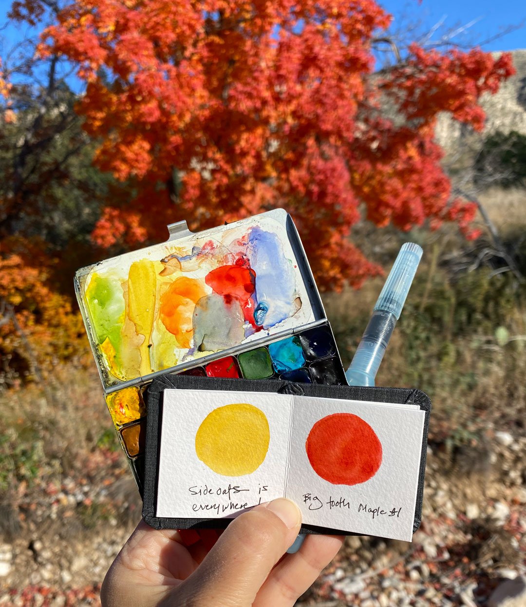
Out in the Field
I took my palette out on several hikes, all in the upper 90’s. The last hike was an especially good test as it got up to 95 F and I went on an 8 mile hike — the weather app said it was 106 with the heat index.


Conclusions
They’re all really lovely paints in their own way, and it was a really interesting experiment to get to try them all!
Here’s a blurb about what I learned about each brand:
M. Graham
- I was a little leery about trying MG as I’ve had some bad experiences with other pigments not setting up in the pan, but so many people recommended it on Instagram that I had to give it a go. I’m happy to report that while it never dried hard in the palette, it stayed put and didn’t make a mess!
- It’s a beautiful color and a real pleasure to work with, however, it handled so differently than all the other paints that it really broke my flow. The paint was kind of the consistency of room temperature butter — so odd
- It’s really highly pigmented — a little goes a long way! You can see this in the swatches were I added water between them.
- Not as granulating as DS or H
- Consistently easy to force a bloom or backrun, something to watch out for.
Schmincke
- Schmincke rewets like a dream and is really easy to work with — truly beautiful and almost transparent/not as granulating.
- It’s a weaker mixer than what I’m used to and can’t stand up to DS transparent red oxide or quin rose. I think if it was on my palette I’d go through a lot of it/have to refill often.
- If the rest of your palette is Schmincke I think it would be a great choice as it mixes fine within their line, but sadly mine is mostly DS and WN.
Holbein
- Holbein has so much granulation — even more than DS! It’s amazing mixed with transparent red oxide.
- I tested ultramarine blue deep, and it leaned more towards red than what I’m used to and threw some mixes off. I suspect that their ultramarine blue pale is more of a green shade and if it wasn’t for some problems that I encountered I’d try the pale version as well
- It took significantly longer to dry than other brands out in the field
- The paint in the pan got a little syrupy in the heat
- The pan stuck to the lid of my palette. I’ve had this happen before with other brands and is not a good sign of things to come!
Daniel Smith with Glycerine
- I added one tiny drop of vegetable glycerine to the pan and stirred it in well with an awl (you could use a toothpick). It really made a big difference in re-wettability! No more rock-hard paint!
- It behaved oddly in the field, tho — the hotter it got, the more the paint got tiny bubbles in it! This was in paint that I worked with the brush with some water on the mixing area of the palette, then the bubbles were visible when I painted the swatch on the paper.
- It had weird fractal patterns in the dried paint! It kind of reminded me of QoR.
- If I was just going to use the paint in studio I’d go this route as it’s a really lovely version of ultramarine blue and the glycerine makes it easy to rewet.
And My Winner Is
Drumroll…
I’m going to keep Winsor & Newton in my palette — it feels like a long walk to get right back where I started lol! WN doesn’t rewet as easily as S or MG, but it’s a trusty friend that I can rely on. :)
Further Reading
Here are some references that I used while researching brands:
- Handprint.com is an excellent resource for geeking out over pigments!
- Jane Blundell has a comparison of ultramarine blues here.
- Dr. Oto Kano has a super useful Colossal Color Showdown video comparing ultramarine blues, with even more brands than I tried! I always love her videos, so much good info.
Affiliate links to purchase these paints on Amazon:
- Holbein ultramarine blue deep
- M. Graham ultramarine blue
- Daniel Smith ultramarine blue
- Winsor & Newton ultramarine blue (green shade)
Hope that helps someone out there! Let me know if you have any questions, and I’d love to hear about your favorite ultramarine blue and what the climate is like where you usually paint!

24 Comments
Mary · May 20, 2022 at 6:46 pm
Lisa,
Would combining 2 brands help?
Lisa Spangler · May 20, 2022 at 7:26 pm
Hi Mary! That’s an excellent idea — but it would take a while to figure out which two! Also a little fussy when I’m traveling. I’ll just stick with WN! :)
Bob Cochran · May 20, 2022 at 7:32 pm
Hi Lisa, I realize this is an inquiry into the performance of the PB29 pigment across different brands. There is lots of chemistry involved here. What water did you use? Tap water, whether sourced from a well or a public water supply? Bottled water purchasable in a grocery store? Reverse osmosis water? Rain water? And so on. Did your paint pans have any soap residues on them? It is really interesting that you use glycerine. I am guessing there are different kinds of glycerines…or glycerines from different sources. I wonder if different glycerine compounds would act differently on the paints.
Coincidentally, Greenleaf and Blueberry recently made available for purchase a supply of their Mayan Blue colors. Their newsletter reached my inbox and I was tempted. I can’t justify a $700+ purchase yet, given that my skill with both drawing and watercolors is really low. Seeing photos of the Greenleaf & Blueberry offerings was fascinating for me. So this is a rambling way of asking you…have you tried any of the blues from Greenleaf & Blueberry?
I will study your post more carefully and possibly comment more. Thank you very much for this excellent article. What I appreciate most is that you tested the paints under realistic conditions. Very good article, and quite useful to me as a budding watercolor student.
Mary · May 20, 2022 at 7:39 pm
Bob, I’m always surprised when I see the really expensive G & B bijoux boxes selling! Some are over $1000! They have great paints, and I know a lot of work goes into making them. I even know some of the minerals are rare & therefore expensive. But like you, I wouldn’t know the difference between a high end lapis lazuli and a more pedestrian one!
Bob Cochran · May 20, 2022 at 8:02 pm
Hi Mary! Yes, I agree with you about Greenleaf & Blueberry products. And I like your suggestion about combining 2 brands.
Mary · May 20, 2022 at 8:24 pm
Bob, I’ve also used Letter Sparrow, and just placed an order for Ruby Mountain. They have a website and also an Etsy shop – the Etsy even has several desert curated palettes!
Logan · May 21, 2022 at 5:31 am
I love color head-to-heads as i always want to know which brand to get for each color – it’s especially helpful that you tried it in the field! It gets hot and humid in the summer and cold in the winter and I’d like paints that can stand up to a variety of conditions.
I tried Holbein, Schmincke, DS and Da Vinci, and came to the same conclusions – Schmincke is too weak compared to my other colors, Da Vinci dries too shiny, and DS flakes off too easily. Holbein was my favorite. It’s strong, beautiful and a good consistency. But i only tried it indoors, and i didn’t try WN. It’s getting up to 95 today so i can do some heat testing!
Bob Cochran · May 21, 2022 at 8:11 am
Mary, thank you for telling me about Letter Sparrow and Ruby Mountain. I looked them both up. I hadn’t thought of checking for specialist suppliers of watercolor paints and I really appreciate your pointing me to both suppliers. I did just order a very small primary color set from Greenleaf & Blueberry — just 3 colors. I will experiment with others too.
Bob Cochran · May 30, 2022 at 11:22 am
Hi Mary, I am interested in learning what you think of Letter Sparrow and Ruby Mountain paints. Do you have a preference? Thanks so much for your thoughts! …..Bob
Lisa Spangler · May 20, 2022 at 8:26 pm
Hi Bob!
I have the original Mayan Blue from Greenleaf & Blueberry — I wonder how old it is now? I only allow myself to use it for special projects. I am looking at ultramarine since I need to be able to refill my pans — I go through a lot of paint! :)
As to water, I just use tap water — I’ll need to be able to use tap water while traveling so that’s what I used for my tests.
I always love your comments — keep them coming!
Bob Cochran · May 21, 2022 at 8:45 am
I often wonder what pigments Michelangelo used and where he sourced them. I have not read much about him. I do realize he worked in fresco. He was primarily a sculptor but he created the Sistine Chapel ceiling frescoes. For that he needed a huge variety of pigments. How did he get then at that time, in the 1500s? He must have had a group of employees…or perhaps a patron…who could go on expeditions to seek out the exact ingredients he wanted for each pigment. He must have done continuous experimentation not just during the Chapel project but over his lifetime. He must have had an understanding of chemistry that was light years ahead of his time. I wonder how he did it!
Mary · May 20, 2022 at 7:32 pm
Might not be too hard – and if it was mixed before traveling? I don’t go by the scientific way you do! I’d mix a bit of the wetter one with the Daniel smith and see how it works. And if it does, pan it up! But then, I wing it…
Lisa Spangler · May 20, 2022 at 8:27 pm
Hi Mary! I’m going to be on the road for months at a time so I’ll need to be able to easily refill pans :)
Mary · May 30, 2022 at 2:51 pm
Bob, I’ve not had time to use the Ruby Mountain paints, but I can say they are very pigmented! I think they are more pigmented than Letter Sparrow (but I LOVE Letter Sparrow’s Pistachio. I think that green works so well with almost everything, and it’s easy to darken it or change the shade.). I swatched out the RM, and love them. I bought the Basecamp set, and added some extras to fill the spots left over. If I had the money, I’d buy the one with all bottle caps, with a reduced price of $175. Bottle caps are equal to or greater than full pans.
Mary · May 30, 2022 at 2:53 pm
Sorry for the duplicate post!
Bob Cochran · May 30, 2022 at 4:01 pm
Hi Mary! Thank you so much for sharing your thoughts with me. It does sound like you have a preference or the Ruby Mountain products. I will study the Basecamp set more closely. Is there a particular reason why they use the bottle caps? Do bottle caps offer an advantage? Thanks again for sharing your thoughts with me. I truly value what you say. :-)
Mary · May 30, 2022 at 4:10 pm
Bob,
I’ve not researched their use of bottlecaps, but my guess is that it’s a recycle thing.
Mary · May 20, 2022 at 8:38 pm
When does Lisa and Jason’s big adventure start?
Mary · May 21, 2022 at 10:24 am
Bob, did you order your primary set from Art Toolkit? They have a nice small G & B primary set for sale – they’ve sold it before, and this might be the last run of it. Comes in an ATK demi palette.
Bob Cochran · May 21, 2022 at 10:58 am
Hi Mary! I ordered directly from Greenleaf & Blueberry, and for their 3-color primary set (it costs like $45 before shipping.) I know Art Toolkit has the small primary set of Greenleaf & Blueberry colors, but at the time I placed the order, I simply did not think of the Art Toolkit product. I guess I was mesmerized by the Greenleaf website. I do have an Art Toolkit, in A5 size. I’m expecting a set of pans from Art Toolkit to be delivered today’s mail, in fact. Thank you for bringing this up!
Mary · May 21, 2022 at 12:50 pm
The little demi palette + 4 colors is a good deal, and the demi, tiny sketchbook, and waterbrush can fit into cargo pants…
Bob Cochran · May 29, 2022 at 8:08 pm
Hi Mary! Now I see that the Art Toolkit Demi palette of Greenleaf & Blueberry colors is indeed a good deal. I received my “Modern Primary Trio” set from Greeleaf & Blueberry yesterday. Yes, they took a while to ship the set to me. I worked with that set for the first time and I started wondering how I’d transfer those colors to the very small Art Toolkit pans. I see the point of buying the Art Toolkit version.
Mary · May 29, 2022 at 8:31 pm
Go for it!