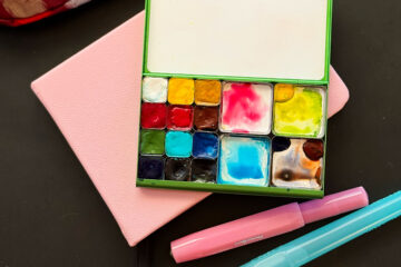
Tomorrow is the first day of spring here in the northern hemisphere so I gave my palettes a good cleaning and I added 2 colors for spring: phthalo blue (green shade) and quinacridone coral!

Just look at all these glorious colors that you can mix with those two:

Check out that gorgeous black that you can get in the lower righthand corner!
I also split my phthalo blue double pan into 2 standard pans, one with phthalo blue green shade and one with the red shade! I’m having a little showdown to see which one I use the most. Will report back with what I find!
Here’s the full list of colors — WN = Winsor & Newton and DS = Daniel Smith:
Folio Palette
I mostly use this palette at home in the studio, but I’ve started taking it on adventures as well. It’s great for BIG brushes. I try to leave space so that I can work the paint in the pan but sometimes too much paint comes out of the tube!
- DS Hansa yellow light (PY3)
- DS Hansa yellow medium (PY97)
- WN Cadmium yellow pale (PY35)
- DS Quinacridone gold (PO48, PY150)
- DS Raw Sienna (PBr7)
- DS Transparent red oxide (PR101)
- DS Phthalo green (PG7)
- DS Phatho blue (green shade, PB15:3)
- DS Phthalo blue (red shade, PB15:6)
- WN Cobalt turquoise light (DS Cobalt teal blue PG50)
- WN Cerulean blue (PB35)
- DS Cobalt blue (PB28)
- WN French ultramarine (PB29)
- DS Quinacridone rose (PV19)
- DS Quinacridone coral (PR209)
- DS Organic vermillion (WN scarlet lake PR188)
- DS Venetian red (PR101)
- DS Indanthrone blue (PB60
Pocket Palette
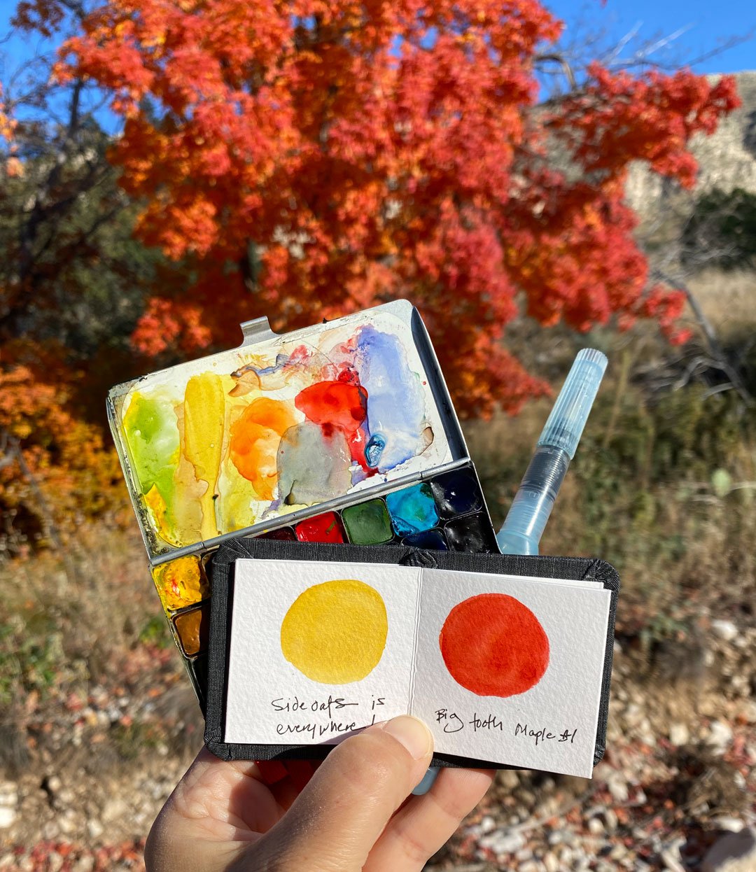
This one is my “work horse” palette — I keep it in my backpack and it’s been on so many adventures with me. It has a pretty similar setup to the Folio, just smaller pans. Cobalt blue, raw sienna and transparent red oxide are in larger pans because I go through those colors more quickly. The 3 empty pans are for mixing.
- WN Cadmium yellow pale (PY35)
- DS Quinacridone gold (PO48, PY150)
- DS Raw Sienna (PBr7)
- DS Quinacridone rose (PV19)
- DS Quinacridone coral (PR209)
- DS Organic vermillion (WN scarlet lake PR188)
- DS Venetian red (PR101)
- DV Cobalt turquoise (PB36)
- DS Phthalo green (blue shade, PG7)
- DS Cobalt blue (PB28)
- DS Phthalo blue (red shade, PB15:6)
- DS Indanthrone blue (PB60)
Let me know if you have any questions, and happy spring!


6 Comments
Steven Richardson · March 19, 2022 at 5:19 pm
Never thought of it: seasonal palettes?
Great idea!
Now, let me storm up basic emotion versions…
😀
Lisa Spangler · March 19, 2022 at 5:41 pm
That just gave me an idea for a stormy palette! all the moody darks and grays!
Mary · March 20, 2022 at 12:00 am
That would be NE OH in winter.
Lisa Spangler · March 25, 2022 at 1:09 pm
LOL, so true! :)
Bob Cochran · March 19, 2022 at 5:50 pm
Does “DV” mean “DaVinci”? I am a little confused because after watching the video demos you have done for Art Toolkit, I had the impression that you normally use Greenleaf and Blueberry paints. I’ve never tried them myself but I would certainly like to. Are Daniel Smith and Winsor & Newton colors what you prefer?
Steven Richardson · March 19, 2022 at 5:53 pm
Mmm, I was thinking ecstatic and joy – perhaps, a surrealistic version.
Thanks kindly for your keen sense of palette versions!😁