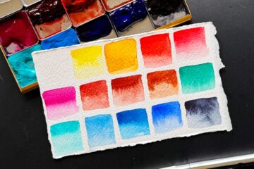
Choosing paints to put on your palette is very personal — it depends on where you live, what you like to paint, how much you enjoy color mixing, and more. Someone who does botanical art will have a very different palette than someone who focuses on urban scenes.
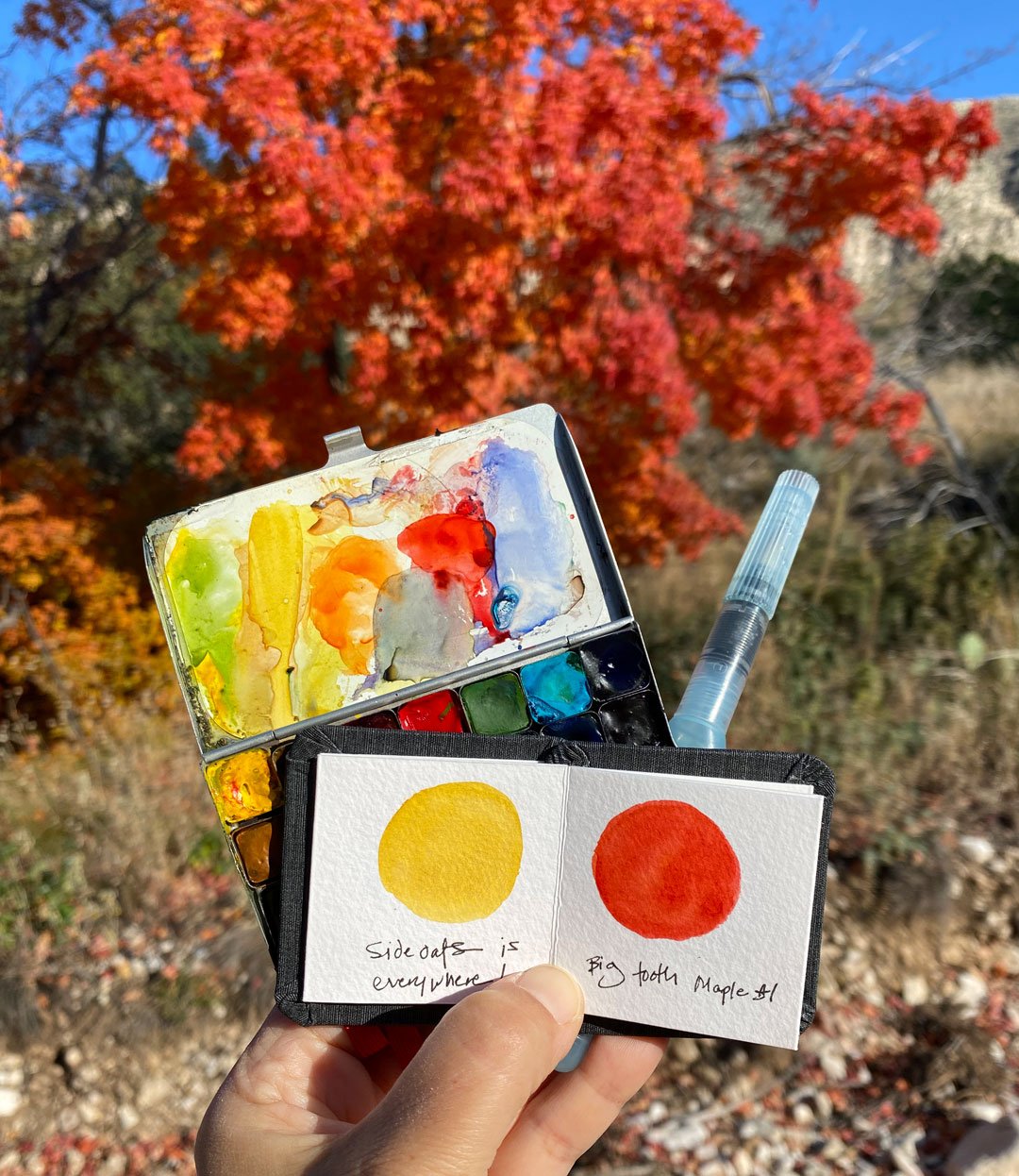
I live in Central Texas but I make frequent trips to the desert, and my focus is on nature — think flowers, landscapes, birds, mountains, skies — but I like to have the flexiblity to paint whatever I see. I like to switch my palette up based on the seasons and locations. I have so much fun tinkering with color — I’m always learning more!
So let’s get to it!
Key: DS = Daniel Smith, WN = Winsor & Newton
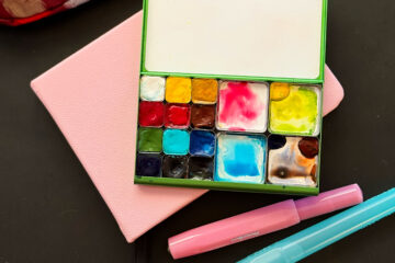
Core Colors
These are the colors that I have on all of my palettes:

- DS Azo yellow – a beautiful transparent yellow; sometimes I have Hansa yellow medium, but I prefer Azo as it’s more transparent.
- DS Raw sienna – used to mix dusty greens, for the desert floor, rocks, and adding a glow to sunset skies without worrying about it mixing with blue to turn green. It’s hard to mix this in the field, so I love having it on my palette.
- DS Quinacridone rose – this is my primary “red”, aka magenta; mix with azo yellow to make red. Learn more about reds in this post.
- WN Ultramarine blue (I love DS UMB but have had problems with it drying hard as a rock in the palette) — great for summer skies in the desert, mixing purples with quin rose, and greens with the azo yellow or raw sienna. Mix with cobalt turquoise light to get a cerulean blue.
- WN Cobalt turquoise light (CTL) — this is one of my favorite colors! (see my blog post here for a brand comparison)
- DS Transparent red oxide (TRO) — another granulating pigment. I mix it with ultramarine blue for my go-to gray.
Here are some of the greens you can mix with these core colors:

More Colors
If I have more room on my palette I like to add these:

- DS Quinacridone coral — (look for PR209) — a transparent warm red that’s perfect for florals, sunsets/sunrises, desert rocks. Mix with quin rose for a nice red or raw sienna for a peachy color.
- DS Quinacridone gold — I use this one to mix greens with any of the blues, and for yellow flowers and autumn leaves.
- Cobalt blue — the perfect sky color; mix with quin rose for lovely purples.
- DS Organic vermillion — an opaque warm red. Since it’s opaque I can layer it for flowers. Mix with phthalo blue for an opaque brown to a dark opaque gray.
- Phthalo blue (green shade) — I’m currently experimenting with Schminke’s cerulean blue hue as its a combination of phthalo blue (PB15:3) and zinc white (PW4). I’ve had some issues with phthalo blue making a mess in my palette and I was hoping the added white would help stabilize it — so far so good!
- DS indigo (PB60 + PBk6 lamp black) or DS indanthrone blue (PB60) — both of these have PB60 in them, while indigo has added lamp black. Great for night skies, and adding dark values. Mix with TRO for amazing grays. Note that both of these will dry significantly lighter than you’d expect!
Convenience Greens

I love having these on my palette for fast mixing in the field, plus they can really make make an impact:
- DS Chromium green oxide — a granulating dull green, best mixed with a yellow or a blue. It’s a great “desert green” for cacti, yuccas and agaves. Mix it with phthalo green to get a color that’s almost like DS jadeite genuine for way less $!
- DS phthalo green (blue shade) PG7 — this can really take over, so watch out. It’s great for mixing pine greens with phthalo blue or TRO
- DS Hansa yellow light (HYL) — I put this in the green section because it’s a cool yellow that I usually add to my palette in spring to mix really vibrant greens. It’s also great for adding a yellow glow. I’m not 100% convinced that it’s lightfast though. Time will tell!
Specialty Colors

If I still have room on my palette after all of that I like to add:
- DS Venetian red — an opaque brownish red. I love it for rocks, shadows, tree bark and misting with cobalt turquoise light to get a nice “desert green”.
- DS Perylene red — a cool true red; I’m still exploring this color but really love it so far.
- Schmincke Transparent orange — it’s a beautiful glowing orange. I can get something close by mixing quin coral and azo yellow, but it’s not quite the same.
- WN Smalt — this is a really lovely granulating purply blue that’s perfect for bluebells in the spring or winter snow shadows. It can be hard to mix in the field and I just love having it on my palette. Mix with raw sienna for a soft gray.
- DS Lunar earth — it’s really similar to TRO but oh the granulation and variation! It’s softer than TRO.
- DS Piemontite Genuine — I love having this on my palette for volcanic rocks/mountains as it has so much color variation.
Further Reading
When I first started watercoloring I searched the web to see what my favorite artists were using — I thought I’d list them here for you:
- Jane Blundell — Her Ultimate Mixing Palette book taught me so much! I highly recommend working through all of the two color mixes. She also shares more palette options on her blog, as well as swatches of the full range from all of the top watercolor manufacturers.
- Liz Steel — Liz is mostly urban sketcher (she also does lovely tea cups!) and she’s always experimenting with mixes.
- John Muir Laws — he’s such an inspiration! His setup is geared towards nature journaling.
- Shari Blaukopf — Shari does a mix of urban and nature sketching.
- Handprint — Bruce MacEvoy did a huge service to watercolorists everywhere with his site. I consult it whenever I think about trying a new pigment or when I want to geek out about color.
Hope that helps and just let me know if you have any questions! And stay tuned, because I absolutely love fiddling with my palettes so I may switch things up — I’ll update this post if I do!
10 Comments
Mary · December 13, 2022 at 9:53 pm
Thanks for this, Lisa – a super helpful post! I’m saving it on my phone. I wonder if the Blundell book works on Android since I’m avoiding Apple for as long as possible, and don’t know if I’ll buy another Kindle Fire. I don’t have a good place to paint – the floor would be good except for my bad back which has to have support. I have a really sturdy lap desk/breakfast bed table on its way which I hope will let me work on my bed. I get cold easily, and well, ’tis the season… I hope the warmth of bed will help.
Lisa Spangler · December 14, 2022 at 9:07 am
Hi Mary! I’m don’t know about Android, I’m an Apple girl myself! When I got it a long time ago it was a PDF. Curling up in bed and painting color mixes sounds so relaxing!
Bob Cochran · December 14, 2022 at 5:14 pm
Hi Mary, I have hurt my back several times over the years, so I can easily imagine how you might be feeling. My heart goes out to you. I hope you will feel a lot better soon. I wonder if you could hire a local handy person — a carpenter for example — to build you a something that is mobile and suits your needs as a base for painting? Or you could buy something on Amazon or Ebay, perhaps, and have it adapted to your liking. I wish there were something I can do to help you.
Meanwhile — yes, stay warm!
Susan Forsberg · February 24, 2023 at 6:40 pm
Thanx for sharing your palette color choices and all the related information. I’m going to play with it next
Ordered a few colors too, from your descriptions I’m going to love having them on the new Lisa palette
I’m making up. I enjoy trying out different palettes and keeping it fresh. Than again hugzzzzz 🥰
My birthday present celebrating 76 times around the sun !
Susan
Lisa Spangler · February 25, 2023 at 12:25 pm
Hi Susan! Happy birthday!! Hope you enjoy your day and exploring new colors!
Cynthia Ahrens · December 13, 2022 at 11:08 pm
Thanks for your color mixing suggestions! Wondering which brand of Cobalt Blue you favor?
Lisa Spangler · December 14, 2022 at 9:06 am
Hi Cynthia! I use both DS and WN — I think WN rewets a little better but they’re pretty close!
Bob Cochran · December 14, 2022 at 5:04 pm
Hi Lisa! Thank you so much for this post. I, too, will be referring to this constantly. I probably should be buying a couple more palettes to allow me to play with different color choices. Especially since I’m starting a foundational drawing and watercolor class next month and it is always good to try out different options.
I want to investigate the links you provide here. The only other artists I’m able to recognize readily is Liz Steel. So it would be good for me to see what other artists suggest.
I like the way you add notes to your color swatch images — they help us students a lot.
Mary · December 14, 2022 at 8:26 pm
Thanks, Bob, not much can be done for my back – I broke it, and vertebrae went into my spinal cord. I can’t walk far – and in the grocery store I’m the person walking around hunched over a cart, which holds only a pack of gum, lol! But, I can walk. I had insurance (this was during Obamacare fights). I was retired so didn’t have to worry about that. And my mom, who i cared for, was doing fairly well for the moment while I was in the hospital. My back hurts. But so do my knees and hips and shoulder. Still, it could be a lot worse.
Bob Cochran · December 15, 2022 at 4:58 pm
All the best to you, Mary! Watercolor painting can be a tremendous comfort and absorbing interest.